Creating an event identity and materials to support children’s mental health care
CLIENT
Children's Crisis Treatment Center
LOCATION
Philadelphia, PA
BACKGROUND
For more than 50 years, Children’s Crisis Treatment Center (CCTC) has passionately served the mental and behavioral health needs of children and families across the Philadelphia region. Through early intervention and comprehensive support, CCTC helps children impacted by abuse, neglect, and developmental challenges reach their full potential.
The Roundup is one of CCTC’s two signature fundraising events. Established in 1996, the western-themed celebration has grown into one of Philadelphia’s most anticipated annual fundraisers, drawing dedicated supporters, corporate partners, and community leaders. Proceeds directly support CCTC’s critical services and ongoing mission.
Year over year, we have partnered with CCTC to deliver unique event branding.

Challenge
Reimagine a longstanding western theme in a way that feels fresh, elevated, and distinct from years past.

Solution
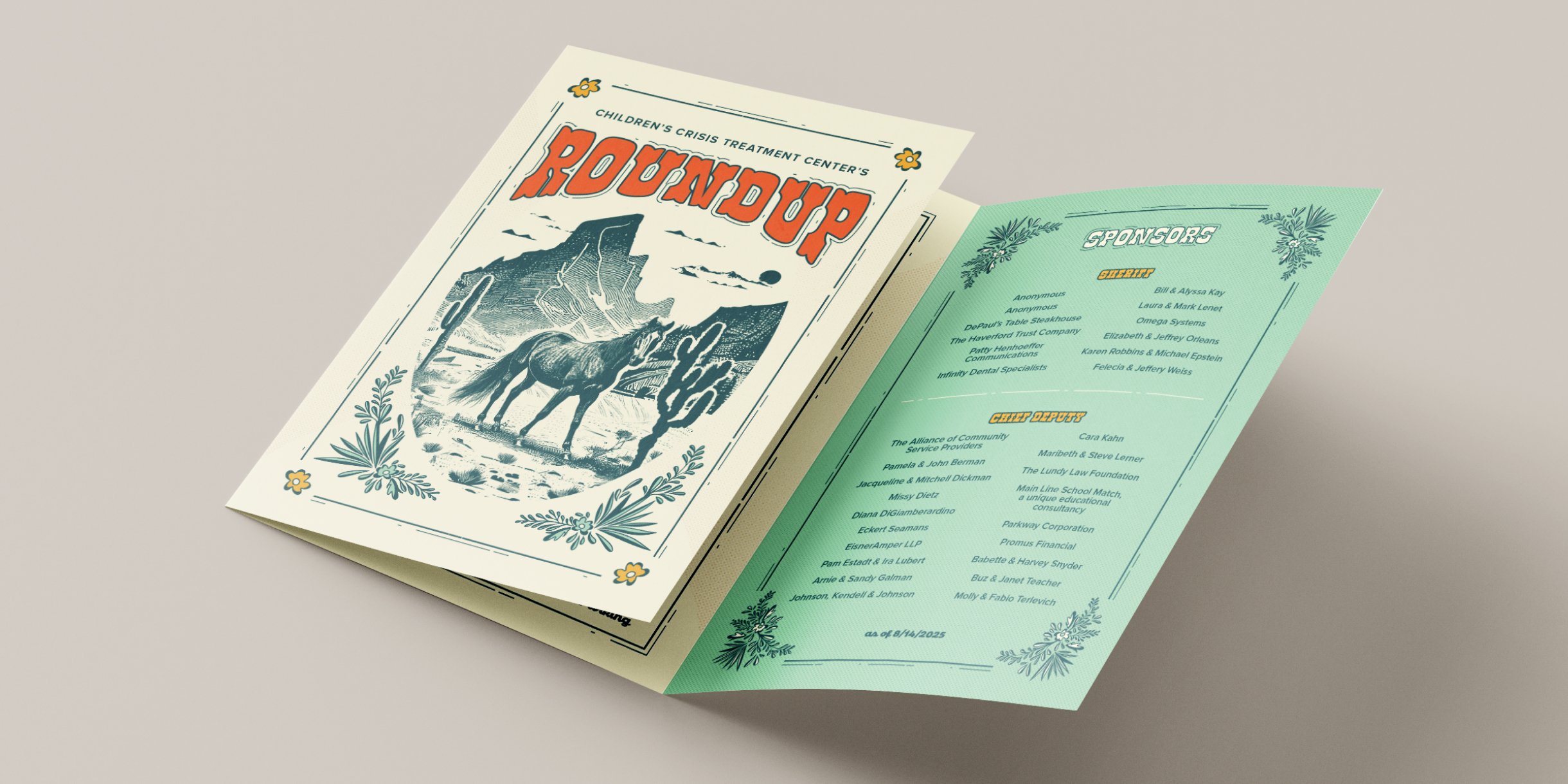
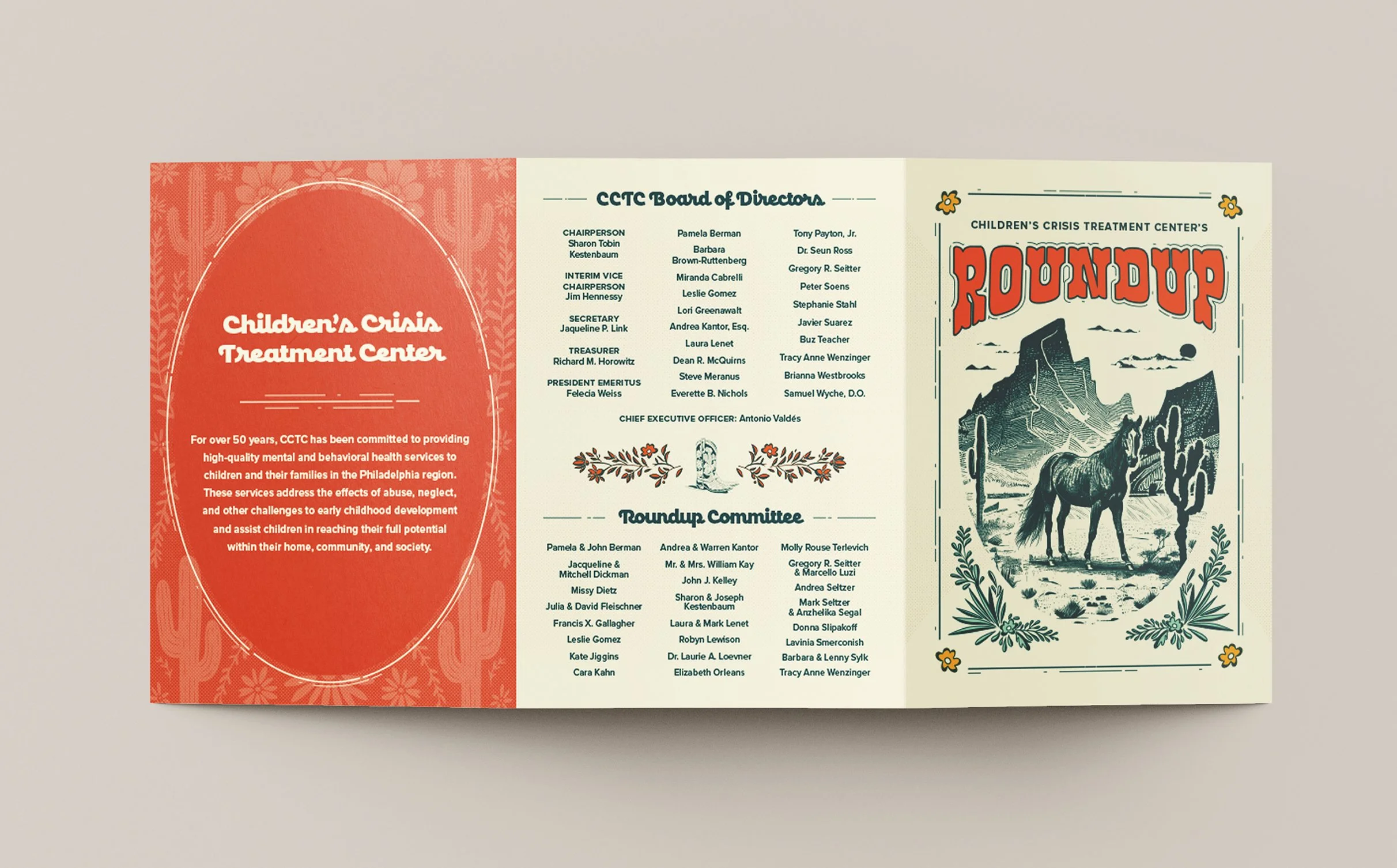
A bold “cowboy deco” visual direction that blends western motifs with graphic refinement.

Results
A distinctive event identity that energized supporters while honoring the Roundup’s legacy.
“We have always found CWP to be professional, reliable, and exceptional designers.
We have worked with Corey and her team on a range of design concepts, marketing materials and publications. She and her team are consistently able to transform our vision into a reality that’s even better than we could have imagined. We get so many compliments on CWP’s designs but what’s really a testament to their talent is that other graphic designers are always admiring their work as well.”
— JAIME PEARLSTINE, Director of Marketing & Communications, Children’s Crisis Treatment Center
THE OBJECTIVE
Create a visual identity worthy of a signature Philadelphia fundraiser
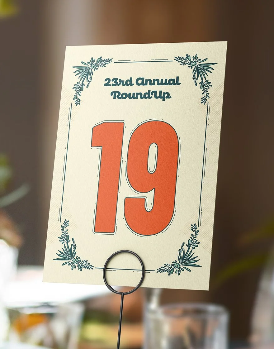
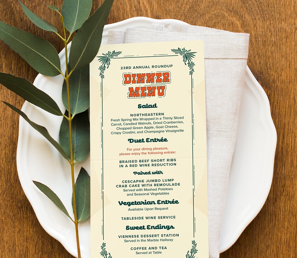
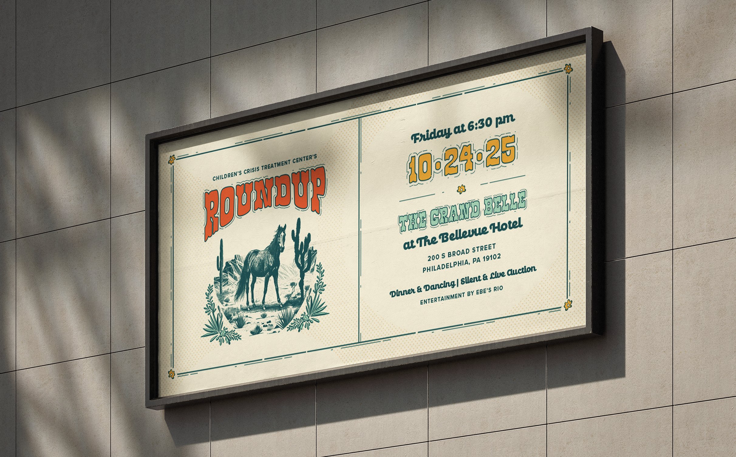
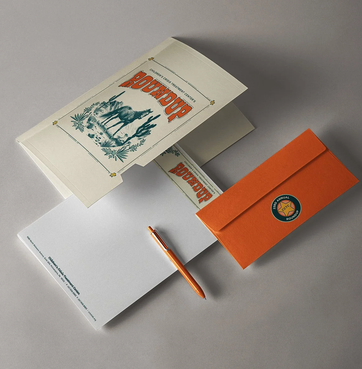
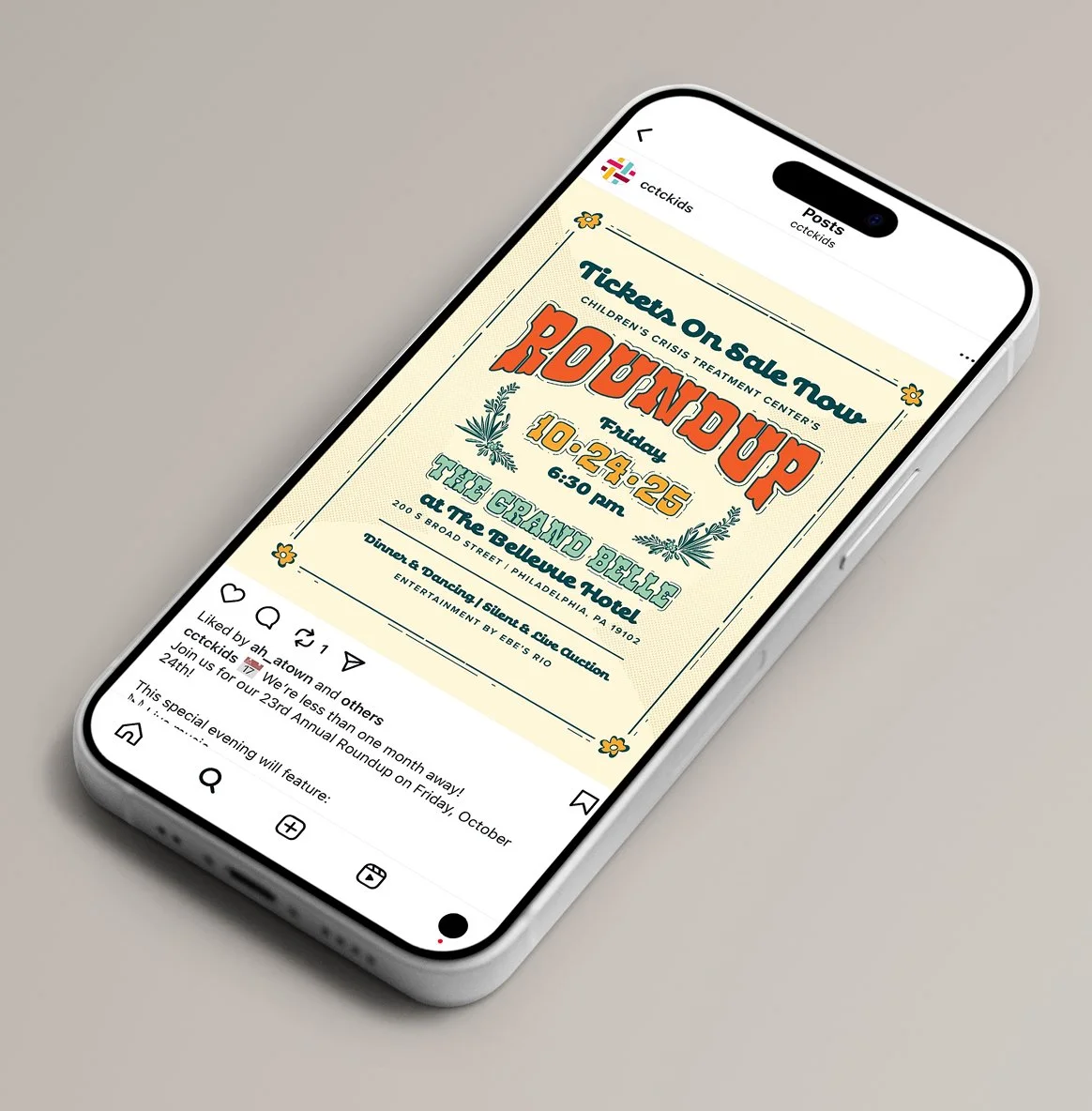
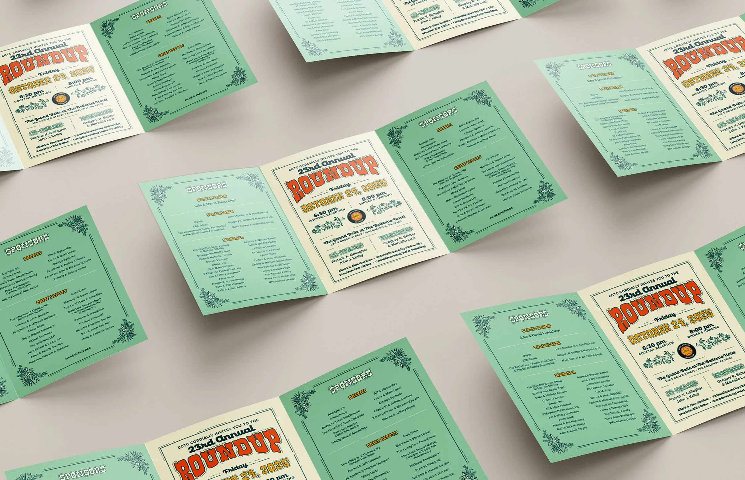
The Roundup has a rich history and loyal following. The goal was to introduce a strong, cohesive design system that elevated the event experience while remaining distinctly western. Because the theme continues year after year, the identity needed to feel new and compelling without abandoning the spirit guests have come to expect. The system also had to translate across invitations, signage, digital promotions, auction materials, and event décor—supporting both fundraising goals and brand awareness for CCTC.
DESIGN SOLUTION
Western tradition meets graphic structure
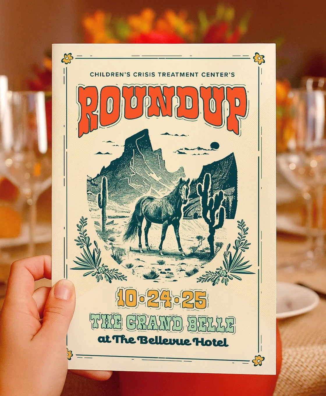
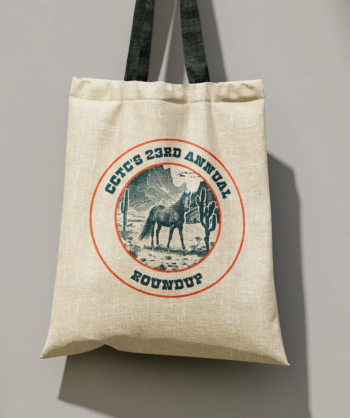
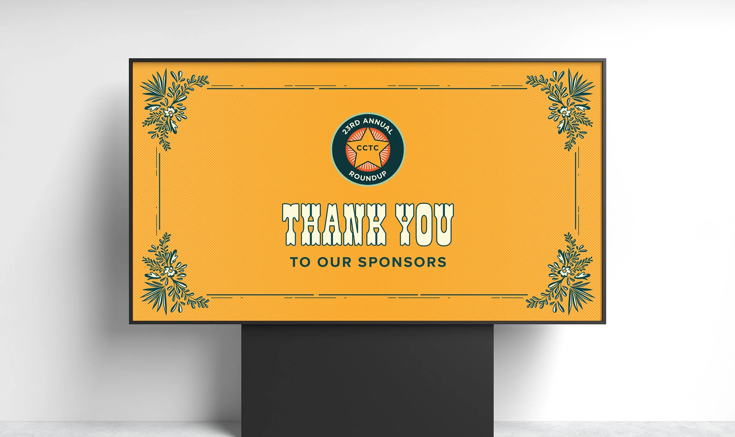
From the initial design audit, the client gravitated toward a direction featuring a strong central focal point, decorative framing elements, and graphic texture. We evolved that inspiration into a refined concept anchored by a central horse illustration, replacing the more literal imagery from reference materials while preserving the dramatic presence of a hero image. To keep the western theme feeling sophisticated rather than rustic, we layered in art deco-inspired structure: clean lines, symmetrical framing, halftone textures, and stylized florals that maintained a western sensibility. The resulting “cowboy deco” aesthetic blended grit and polish, nostalgia and sophistication. A bolder color palette amplified the impact, ensuring the event felt vibrant and celebratory while standing apart from prior years’ materials.

COLOR PALETTE
Forrest Green
Orange
Yellow
Mint
Cream
CHALLENGES & ACCOMMODATIONS
Keeping a familiar theme from feeling repetitive
Because the Roundup returns each year with a western dress code and aesthetic, the design must walk a fine line. It needs to feel recognizably on-theme—boots, hats, horses, and heritage—while avoiding visual fatigue for long-time attendees. The challenge was introducing enough graphic structure and boldness to create distinction, without straying so far that the event lost its identity.
OUTCOMES
An elevated experience with renewed energy
The final identity gave CCTC a cohesive visual system for one of its most important fundraising events. The refreshed look generated excitement, supported marketing efforts, and reinforced the significance of the Roundup within Philadelphia’s philanthropic community. Most importantly, it helped spotlight the mission behind the celebration—ensuring the focus remained on supporting children and families across the region.